CHALLENGE: The long-awaited label refresh is finally here, and there is now a need for a design brand collateral update. With the new data of phase one, the team decided to expand their reach to a younger audience and invest more in point-of-sale items, OOH, and digital advertising.
GOAL: We built upon the already existing and successful core brand voice and imagery with the newly acquired data from phase one. Additionally, all marketing materials were updated to match the new label refresh. The deadline for all marketing and creative was under two months before the Q3 rollout and the long-awaited label refresh.
ABOUT THE BRAND: San Antonio Winery first opened its doors in 1917 by the Riboli family. Inspired by its community of Los Angeles, CA, the Riboli family sought to create a sweet red varietal to add to every gathering. In 1967, Cardinale was introduced as a sweet red blend with aromas of ripe berries & refreshing grape flavor. After Cardinale’s success, the Riboli family decided to create three additional flavors that go well with everyone’s favorite meals. San Antonio Winery collection of four distinct flavors can be enjoyed at any time of day.
PROJECT: Branding, Campaign, Social Posts, Photography, Website, Digital Marketing
MY ROLE: Art Director, Designer, Researcher, Video Editor, Photographer
BRANDING
LOGO + tAGLINE
For generations the iconic dark red San Antonio label has remained the same until now. The brand and label has changed to fit the growing Riboli portfolio. What was known as the San Antonio Wines collection is now San Antonio Specialty.
After the success of phase one, we decided to expand on the feel with added cleaner & brighter elements that attract a younger & less conservative audience while still complimenting the new name and label. In addition, I created the San Antonio Specialty logo to match the label per the client's request. Label was designed by Malo Design.
CAMPAIGN
POINT OF SALE
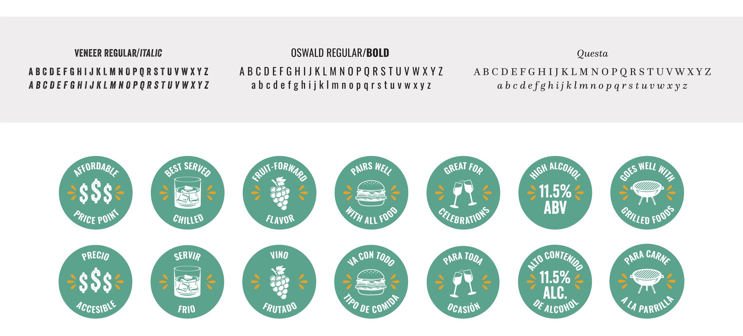
When designing the POS materials, the goal was to create something that complimented the traditional established brand. Still, I also wanted to create a look that connected with its dynamic & vibrant consumers. I found inspiration in its growing Los Angeles multicultural community and the San Antonio Winery neighborhood where I grew up. I used stucco textures, rugged fonts, & vibrant colors to create an approachable celebratory vibe.


